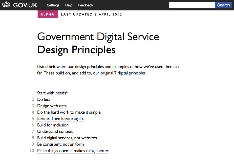
 This week, the UK’s Government Digital Service unveiled a list of ten Design Principles. These are intended for for people building digital services under the GOV.UK domain, but I hope they will prove significant for absolutely anyone creating websites, intranets or other digital services, especially for those of us in-house.
The principles are:
- Start with needs (user needs, not Government needs)
- Do less
- Design with data
- Do the hard work to make it simple
- Iterate. Then iterate again.
- Build for inclusion
- Understand context
- Build digital services, not websites
- Be consistent, not uniform
- Make things open: it makes things better
For a moment, while reading this, I found myself actually shaking with happiness. It felt so good to see so much of what I believe to be true, put so clearly, in attractive way, by an organisation that needs little introduction.
In the next few days, I can see myself, and I hope many thousands of others pointing it out to any passing chief executive, IT director or communications director, and saying “look, the UK Government says start with user needs.”
That might be an attention-grabber, but I’d argue it is an important one.
The design process must start with identifying and thinking about real user needs. We should design around those – not around the way the ‘official process’ is at the moment
– 1. Start with needs
Too many intranet projects ignore user needs in favour of organisation needs, and can only succeed by bending employees behaviour to fit the tool (or being very lucky). By starting with the user, you can help people do what they need to do. This gives you something to build on.
Users are already using our services . This means we can learn from real world behaviour … [we should] continue this into the build and development process – prototyping and testing with real users
– 3. Design with dataRelease Minimum Viable Products early, test them with real users, move from Alpha to Beta to Launch adding features and refinements based on feedback from real users.
– 5. Iterate. Then iterate again
Don’t just use logs and other evidence to create your next set of designs, take a leaf out of The Lean Startup and test your theories in the next generation of prototypes. And repeat.
We should build a product that’s as inclusive, legible and readable as possible…We’re designing for the whole country – not just the ones who are used to using the web.
– 6. Build for inclusion
It is so tempting to only consider the most likely users. After all, your project needs their participation to even stand a chance of being a success, but they’re not the whole organisation. Often, the people you can help the most are the ones who’re being helped the least.
We’re not designing for a screen, we’re designing for people. We need to think hard about the context in which they’re using our services. Are they in a library? Are they on a phone? Are they only really familiar with Facebook? Have they never used the web before?
– 7. Understand context
Context of use is so important, and has been badly neglected through the computer-browser era. We’re beginning to appreciate the benefits of responsive design (btw. try resizing the Design Principles page) and what that can mean for people using anything other than a computer, but there’s something more. Perhaps your user is in a library on a phone? From this point, things are only going to get more complicated – the era of everyone accessing your intranet from Internet Explorer is over.
Our service doesn’t begin and end at our website. It might start with a search engine and end at the post office.
– 8. Build digital services, not websites
For most businesses, an intranet that only exists for what happens online is meeting only a fraction of its potential. If we start thinking of intranets as being the first part of a digital service, we can start to unlock that potential.
