Flash.gotoAndStop(2020)

Pixelated website background with two flash logos

As I write, Flash plugin is about be wiped off millions of computers around the world, and the web will become a safer place. I’m not sad about this this closing of a chapter in the web’s history, although I do want to remember Flash for some of the bad and a lot of the good.

It’s the early 2000s in Hammersmith, London. The banquet hall of the Hilton Hotel has hundreds, possibly thousands of seats facing a brightly lit stage. We walk in to Rick Wakeman-esque organ music, and are treated by Macromedia to the state of the art in Flash including a hotel booking tool that updates on the fly.

“That’s it,” I think, “they’ve won the web.” I wouldn’t need to continue to battle to get site designs to look perfect on every browser, it could just work in Flash. We could have real-time interactions and get away from page-by-page transactions for even minor changes. Of course, that’s not what happened.

Screenshot of iHotellier application in Flash. Three panels across the width of the display contain in turn: date selection, room selection, and payment details.
Screenshot of the iHotelier interface for the Broadmoor Hotel – from https://articles.uie.com/potential_of_flash/

I’d been tinkering with Flash since 2000 when it started emerging as a more practical alternative to Macromedia’s own Shockwave. Like many, I played around with transitions, and then tried out encoding simple physics, and various elements built to operate in image-sized windows on HTML pages. Then came the era of full page websites in Flash, a strategy I fought but I was unable to reject. Ultimately, we built a very attractive website for my employer at the time.

BDP website from around 2004. Large format image of the Glasgow Science Centre with introductory text plus three news items, and a navigation menu.
The BDP website from around 2004

What’s funniest looking back at this design, is the tiny size of the overall Flash movie at 760×468 pixels. The download size was small too, at around 64kb, to minimize any need for a tedious loading animation, and nearly all content was loaded on demand. Background image loading first used a tiny 1-3kb image, and cross-faded in the higher resolution 50-80kb image once it had loaded. You might note the use of the Frutiger font too. I’d later run project pages on this Flash site plus a number of HTML sites from a single database.

So, with a relatively small plug-in, we could have pixel-perfect cross-browser design, exciting animation, AJAX before it became a thing, progressive loading and even low-bandwidth alternatives, all in a single package and years ahead of HTML at a substantially lower level of complexity.

Yet, I found I was more than happy to take a step backwards and return to building websites in HTML. I’d learned a lot about JavaScript through Flash’s equivalent ActionScript, and the Prototype and jQuery libraries took a lot of the pain out of developing. Meanwhile, CSS had reached the point of being robust and consistent enough, and sites like CSS Zen Garden changed the way we looked at it. Furthermore, we could manage content in far better ways than we could in Flash.

To me, Flash would be best for games (the Grow series, Flight, Hedgehog Launch were a few favourites), and would find a life of its own as the only practical tool for video. It would also become synonymous with intrusive and ghastly adverts, and enjoy more than a decade of high-profile vulnerabilities.

I wouldn’t work with it much more. I’d build a graphing tool, and a few interactive apps and newsletter tools for intranets, but it wasn’t what was needed most of the time. It’s now eight years since I had to do anything in a Flash timeline, and I haven’t missed using it.

It saddens me that Macromedia, and then Adobe didn’t push Flash towards its potential. It was always going to struggle without a free creation environment, and later versions seemed to become more complicated for fewer benefits.

While I’d been arguing for standards-based HTML, it really took the 2007 announcement that the iPhone would not support Flash to get the attention of my directors.

The Apple announcement alone would not be enough as it would take years to build up a significant base of users, and I suspect the arrival of Google Chrome and an ecosystem of powerful javascript engines brought usable web technologies at a far lower cost. Ultimately, Adobe was probably not the custodian that Flash needed.

Spending half a decade working in Flash made me a better user-centred designer, and a better programmer too. I came to better appreciate working with content in limited space, and the timeline helped me understand designing with time as one of the dimensions. Some of that, I’ll even say was fun.

I won’t miss Flash, but it showed us the heights and depths of what the web could achieve. I’ll remember that fondly, and I’m glad it existed.

Footnote: other people’s reactions

I knew I wouldn’t be alone in wanting to bid farewell to Flash, and it is fun to see some very different opinions. Flash, for me, was a tool for building on the web, but for others it was an animation tool or something else.

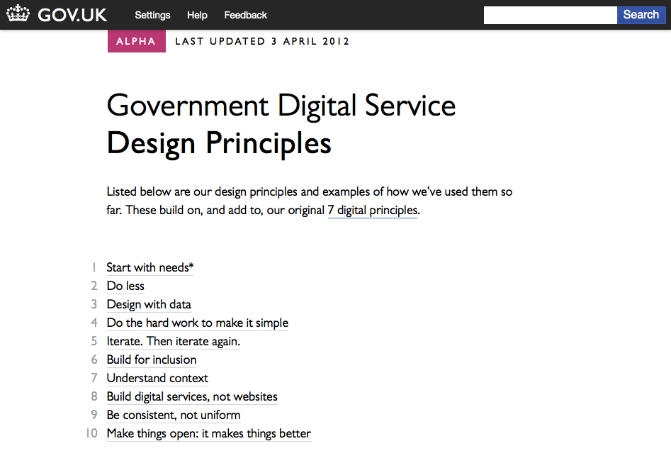
GOV.UK’s Design Principles are big news for intranets

Screenshot of the GDS Design Principles web page This week, the UK’s Government Digital Service unveiled a list of ten Design Principles. These are intended for for people building digital services under the GOV.UK domain, but I hope they will prove significant for absolutely anyone creating websites, intranets or other digital services, especially for those of us in-house.

The principles are:

  1. Start with needs (user needs, not Government needs) 
  2. Do less 
  3. Design with data 
  4. Do the hard work to make it simple
  5. Iterate. Then iterate again. 
  6. Build for inclusion 
  7. Understand context 
  8. Build digital services, not websites 
  9. Be consistent, not uniform 
  10. Make things open: it makes things better

For a moment, while reading this, I found myself actually shaking with happiness. It felt so good to see so much of what I believe to be true, put so clearly, in attractive way, by an organisation that needs little introduction.

In the next few days, I can see myself, and I hope many thousands of others pointing it out to any passing chief executive, IT director or communications director, and saying “look, the UK Government says start with user needs.”

That might be an attention-grabber, but I’d argue it is an important one.

The design process must start with identifying and thinking about real user needs. We should design around those – not around the way the ‘official process’ is at the moment
– 1. Start with needs 

Too many intranet projects ignore user needs in favour of organisation needs, and can only succeed by bending employees behaviour to fit the tool (or being very lucky). By starting with the user, you can help people do what they need to do. This gives you something to build on.

Users are already using our services . This means we can learn from real world behaviour … [we should] continue this into the build and development process – prototyping and testing with real users
3. Design with data 

Release Minimum Viable Products early, test them with real users, move from Alpha to Beta to Launch adding features and refinements based on feedback from real users.
5. Iterate. Then iterate again 

Don’t just use logs and other evidence to create your next set of designs, take a leaf out of The Lean Startup and test your theories in the next generation of prototypes. And repeat.

We should build a product that’s as inclusive, legible and readable as possible…We’re designing for the whole country – not just the ones who are used to using the web.
6. Build for inclusion 

It is so tempting to only consider the most likely users. After all, your project needs their participation to even stand a chance of being a success, but they’re not the whole organisation. Often, the people you can help the most are the ones who’re being helped the least.

We’re not designing for a screen, we’re designing for people. We need to think hard about the context in which they’re using our services. Are they in a library? Are they on a phone? Are they only really familiar with Facebook? Have they never used the web before?
7. Understand context 

Context of use is so important, and has been badly neglected through the computer-browser era. We’re beginning to appreciate the benefits of responsive design (btw. try resizing the Design Principles page) and what that can mean for people using anything other than a computer, but there’s something more. Perhaps your user is in a library on a phone? From this point, things are only going to get more complicated – the era of everyone accessing your intranet from Internet Explorer is over.

Our service doesn’t begin and end at our website. It might start with a search engine and end at the post office.
8. Build digital services, not websites 

For most businesses, an intranet that only exists for what happens online is meeting only a fraction of its potential. If we start thinking of intranets as being the first part of a digital service, we can start to unlock that potential.


Form design – simple mistake

For good or bad, or probably just being plain nosey, I find myself attacking a questionnaire on my radio listening habits.

It’s a long and fiddly one, and just when I find myself getting towards the end, I get thrown by this:

Poll form - thinking vertically not horizontally

A cold viewing, I suspect, would make absolute sense. However, I’ve just been through twenty or thirty pages, with each one’s answers appearing in the horizontal axis. Here I find myself with only three distinct answers for four questions.

Otherwise, don’t get me started on the next button on the left, and the back button on the right.

Benjamin Zander: In contribution, there is no better!

Benjamin Zander in actionI feel indebted to Garr Reynolds of Presentation Zen for introducing me to Benjamin Zander, or at least the following video of him talking to music students:

Link: YouTube – Benjamin Zander Speech Preview

Zander is the British-born conductor of the Chicago Philharmonic Orchestra, clearly an incredible presence on stage, and apparently now a big name on the management training circuit. Here, he is talking about being a performing musician, but the parallels are not lost:

We are about contribution, that’s what our job is … everyone was clear you contributed passion to the people in this room. Did you do it better than the next violinist, or did he do better than a pianist? I don’t care, because in contribution, there is no better!

Spin that yourself any way you like, but Zander clearly isn’t a man interested in the substandard.

LoveFilm’s “New and Improved” Rental Queue – the last straw?

When my DVD rental firm LoveFilm (www.lovefilm.com) told me they were improving my DVD rental queue, I was delighted. Now, I fear I will get a worse service, and a worse experience.

LoveFilm Queue - new and improved, apparently

I’ve been using them for two years now, and generally have been pleased. A while back they seemed utterly incapable of sending anything within my queue’s top twenty, dipping once I recall into the top forty. A while back, they hit on a wheeze called FastTrack, a kind of guaranteed delivery service for items that were no longer in demand. If you wanted one of those films, all you needed to do was put it in your top ten – why the song and dance?

You see, at least they had a queue system. It worked, of a fashion.

Now, instead I just rank my items as high, medium or low.

LoveFilm Queue - a question of priority

I suspect this means it’ll skirt over my High Priority discs, and pluck something from Medium. With a list that hovers around the 100 mark, I don’t expect any of the low priority items will ever get a say.

That’s what I mean about ruining the experience. The discs I wouldn’t keep at the head of my queue always got a chance. I liked the way they’d bubble up the queue, and thrust themselves at you at some unsuspecting moment. They’d done their time, therefore they deserved to be watched. How will the delights like The Station Agent or Lagaan ever reach me if I pause each time I think about raising their priority?
You can probably criticize me for both wanting too much control, yet relishing the lack of it.

Right now, I think I stand even less chance of getting the discs I want, when I want them, compounded by losing out on the little gems. Perhaps I’ll make everything low priority, except for a few. I’ll let you know if it works. Otherwise, know any rental sites that will import my queue (albeit broken?)

Mastodon